The Page Designer tool allows us to edit the layout of the details pages, as well as the filters.
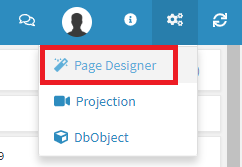
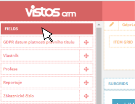
Selecting Page Designer from the setup menu will open the designer window for the entity in which we are launching from.In the Fields list on the left, we see the fields that can be used in the entity.
The VIEW BLOCK DESIGNER (identified as the green section) gives us the ability to change the order using the arrows, and hide unnecessary entities using the disable option (square icon with x).

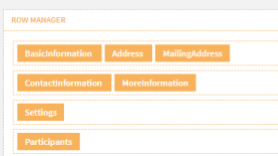
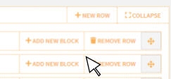
The ROW MANAGER (located below the VIEW BLOCK DESIGNER) allows us to add new rows and blocks. Add a new row to the Row manager by using + NEW ROW. You can also remove unnecessary rows (REMOVE ROW button), as well as move rows using the drag-and-drop icon. ![]() .
.
Use the button (+ NEW BLOCK) to add new blocks to corresponding row. You can also move the blocks by dragging and dropping the block where needed.
Below ROW MANAGER is the BLOCK MANAGER. This contains individual sections and blocks, including fields – as they appear in the layout of the detail. We can name the new block here by selecting the pencil icon that is above each block, type the name and then save it (disk icon). We can also assign a color to each block.

Blocks are graphically separated with a gray separator between the blocks. Using the arrow below the title and block options icons, we can also select a color for the border of that specific block.
Adding a column to a block (using the plus icon, see figure) will keep the same title and border color, and the columns will not be graphically separated. The columns and fields will sit side-by-side within the block.

Fields can be drag-and-dropped from the list of Fields in the left section of the Page Designer, or moving fields between blocks (you may drag a field from one block into another). Clicking the disable field icon (x inside a box), located in each of the fields on the right, will hide the label for that particular field. By checking the eye icon, the entire field will be hidden, but will be physically present. The trashcan icon removes the field from the layout, and back to the Fields section for future use. If we click on the checkmark, other fields will go into the change mode, with each arrow showing up and down. Clicking on one of these arrows will move the selected field to either above or below the field depending on whether you selected the up or down arrow.
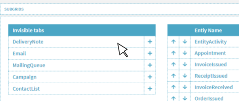
To maximize customization of the layout, we can choose individual bookmarks in the Subgrid. Adding a new item to the subgrid is done using the + icon. Change the order in the subgrid using the arrows, and remove the item from the subgrid by selecting the trashcan icon.
